Start with light, not color
Here's what actually decides this: where your wedding happens and what the light is doing when it does. A color that looks commanding in a showroom mirror can behave completely differently under string lights at nine p.m. or full sun at two.
So before you pick a side, answer two questions. Is the ceremony in daylight or after dark? Is the venue open air or a formal room? Those answers do more work than any color preference.
After dark: midnight beats black
Under evening light, true black goes flat. It swallows the shape of the lapel, erases the line of the shoulder, and reads as a silhouette in photos. This isn't opinion — ask any wedding photographer what black does under flash.
Midnight blue is the fix. In dim light it reads richer than black — deeper, with the detail intact. To the eye across the room it still says "black tie." To the camera it says it better. If your invitation says black tie, midnight blue is the answer most grooms haven't heard yet.
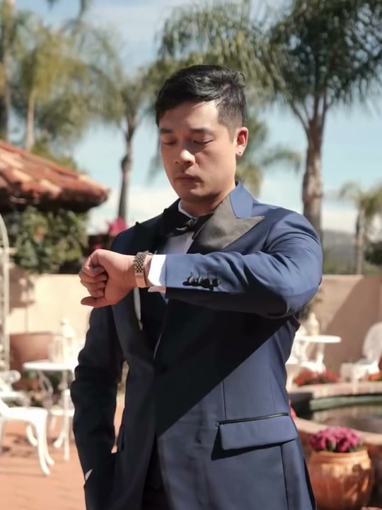
Daytime and outdoors: navy earns it
For a daytime or outdoor wedding, navy is hard to beat. It breathes against skin tones, photographs warm in natural light, and holds its color in sun instead of bleaching out. A garden, a vineyard, a rooftop in June — navy belongs there the way satin belongs in a ballroom.
And for the warm-weather formal wedding, there's a third door: an ivory dinner jacket over dark trousers. It's the classic alternate for a reason — evening polish without evening heat.
When black still wins
None of this banishes black. Black wins when tradition wins: strict black tie, a formal evening in a formal room, a family expectation that the groom wears black. Those are real reasons, and honoring them is a confident choice. What black shouldn't be is the default — the color you pick because you didn't decide. If you're choosing black, choose it on purpose.
The pattern rule
One more thing, and it matters more than the color: you're not wearing a pinstripe suit to your wedding.
Pinstripes are business language. They were built for boardrooms, and no matter how good the cloth is, they read like you came straight from work. Same for bold checks and anything you can name from across the room.
Wedding cloth should carry texture that's nearly invisible — a subtle weave, a faint herringbone, something you only notice up close, the way the camera does. The garment reads as one deep, quiet color from twenty feet and rewards a second look from two.
The one deliberate exception: a ceremonial jacquard on an evening dinner jacket. That's pattern as occasion-wear — chosen for the night, not borrowed from the office. It's the difference between decoration and dressing up.
Quick answers
Navy or black for my wedding suit?
Decide by light, not preference. Daytime and outdoor: navy. Evening and formal: midnight blue over true black, which goes flat after dark.
Why midnight blue instead of black?
Under evening light and flash, black loses depth and detail. Midnight blue holds both — it reads richer than black in exactly the conditions where you'll be photographed most.
When should I actually wear black?
When tradition is the reason — strict black tie, formal evening, family expectation. Choose it deliberately, not by default.
Can my wedding suit have a pattern?
Texture, yes — pattern, almost never. Pinstripes read as business. Keep the weave so subtle it only shows up close. The exception is a ceremonial jacquard on an evening dinner jacket.
Let the planner read your light
Venue, date, time of day, her colors — give it two minutes and it builds the color direction for you.
Take Our Wedding Look Quiz